A few weeks ago I managed to have a free day to go down to the Royal Academy on Piccadilly to see the Abstract Expressionism exhibition. This is an absolute massive exhibition, and apparently it’s the first time all of the major abstract expressionists of been brought together in one place in London since the 1950s
Information about the exhibition:
https://www.royalacademy.org.uk/exhibition/abstract-expressionism
The show was huge, and it was honestly too much take in at any one time and the only thing I really came away with in any important sense was an extremely overwhelming sense of colour. Yet that’s enough for me. I’d never really thought about the abstract expressionists as revolutionists of colour but indeed that’s exactly what they were. In their hands colour, that includes the monochrome of black and white, takes on a completely new aspect, completely new from the whole history of painting. Yet their sense of colour is also deeply embedded in the ancient history and tradition of painting. It was so exciting; I really wasn’t expecting this.
Okay I’ll own up, actually never liked abstract expressionism. Thing is, I never saw any of it. There’s very little of it in Britain, where I had my creative education and certainly there wasn’t any of it in Vancouver where I grew up (NOT an art city, tbh). I saw glimpses here and there: the occasional Jackson Pollock in the (excellent) Seattle Art Museum and a Motherwell at the Tate Modern, but I had never seen them brought together in any meaningful way and I’d certainly never seen a sufficient number of them to really get strong sense of what these artists accomplished.
Instead, like many people, what I really saw was a whole lot of derivations and simulacra of copies that vaguely remembered resembled abstract expressionism at a level far below pastiche – adorning the walls of banks and institutions. That is, washes of bland colour designed to create a soporific and unchallenging atmosphere away from the intellectual/emotional engagement invited by figuration. How lame; how horrible, who on earth would like abstract expressionism if this is what they think it is?
Luckily I grew up and started to engage more meaningfully with it. It was an interesting trajectory, Rauschenberg led me to an interest in the earlier abstract painters which led me to an interest in Motherwell which led me to bit by bit more than appreciation for abstraction, although (until the RA show) I still completely rejected people like Barnett Newman.
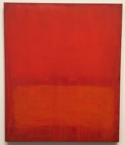
“Mark Rothko, no name, 1969, at Museum of the University of Navarra”
[By Mika58 – Own work, CC BY-SA 4.0, https://commons.wikimedia.org/w/index.php?curid=44153557%5D
Simon Schama’s Power of Art opened my mind up to Mark Rothko. Yes I admit, before Simon I actually thought Rothko was boring. Pretty, but boring. I’m not sure I necessarily agree with Schama’s emotive take on Rothko but it certainly engaged me to look at the paintings differently and spend a lot more time with them at the Tate. I grew to love them. I think it’s not necessary for art critic or an art historian to necessarily be “correct” (boring!) but to engage and inspire and then I can just make up my own mind. (Thanks Simon Schama and Waldemar Januszczak!)
So, the exhibition: as I said, the thing that I came away with was this sense of being completely assaulted by colour. The way in which the colour appears and doesn’t appear in these paintings is completely fascinating and absolutely absorbing. The greatest experience for me was understanding finally, something I’ve never been able to understand from looking at any reproduction or matter how high quality. Which is that Jackson Pollock was an incredible, delicate, sensitive colourist. His colouring is on a level with the greatest Renaissance painters, and with my personal favourite colourist John Singer Sargent. Okay how can I compare Jackson Pollock to Fra Angelico or John Singer Sargent or Titian for example? Because of the way in which he lays the colours on the canvas, the combinations, the way moves the colour into shapes, the way the eye follows the colour across the canvas. See, amazing. I’m really hoping to find some kind of book or article on Jackson Pollock as a master colourist and his relationship to the tradition of colouring.
BUT, you have to go see the paintings in the flesh to get any of this. NO reproductions can offer a real sense of the colour. Sadly.
Colour is the most interesting subject in painting, although relatively not that much written about it.
Now of course in terms of my own research, this brings me to think about what was going on in cinema at exactly the same time as the Abstract Expressionists were doing these incredible things with colour; of course! colour cinema in the 1950s! the successes of Technicolor and so forth! the development of blazing new film stocks and the evocation of a whole brightly coloured world, fantastical and seductive! Haven’t got any conclusions about this now … it’s all going on in my head but it’s really interesting … stay tuned.
Mark Hudson’s review in the Telegraph
http://www.telegraph.co.uk/art/what-to-see/abstract-expressionism-royal-academy-review/
Januszczak’s review in the Times
http://www.waldemar.tv/2016/10/abstract-expressionism-the-show-of-the-year/

You must be logged in to post a comment.